1 - Introduction
什么是styled components呢?它是一种CSS-IN-JS样式解决方案。虽然有很多种解决方案,但是这一种方案被很多公司使用。

使用这个库的好处:

就是可以这样写组件的样式:

这个库来设置样式,我用起来感觉不是很好,不是很直接。但是我在mui里面看到过这种用法,mui对此应该做了增强,没想到是这个库的作用。反正都了解一下吧,这个课程也只是入门课程。

2 - Installation and Setup
创建项目:npm create vite@latest styled-components-demo。
vscode安装插件:

安装依赖:npm i styled-componens。
3 - Basic Styled Component
这节课为一个简单的button设置样式。我们可以直接在button上面设置style属性,也可以设置className属性,但是这里我们使用styled component的方式来做。
x321// App.tsx23import "./App.css";4// 1、引入styled函数5import styled from "styled-components";67// 2、定义组件的样式8const StyledButton = styled.button`9 border: 2px solid #4caf50;10 background-color: #4caf50;11 color: white;12 padding: 15px 32px;13 text-align: center;14 text-decoration: none;15 display: inline-block;16 font-size: 16px;17 cursor: pointer;18 transition: 0.5s all ease-out;19`;2021function App() {22 return (23 <>24 <button>Button</button>25 {/* 3、使用定义好样式的组件 */}26 <StyledButton>Styled Button</StyledButton>27 </>28 );29}3031export default App;效果:

可以看到,以组件的方式来定义样式,使用这个组件就有了样式。
但是我们创建一个自定义组件,需要的不仅仅是样式,还需要定义很多属性,这该怎么办呢?之后会讲到。
现在来看怎么将组件抽离出来。
创建下面的文件:

x
1// src\components\Button\Button.styles.ts2// 1、引入styled函数3import styled from "styled-components";45// 2、定义组件的样式6export const StyledButton = styled.button`7 border: 2px solid #4caf50;8 background-color: #4caf50;9 color: white;10 padding: 15px 32px;11 text-align: center;12 text-decoration: none;13 display: inline-block;14 font-size: 16px;15 cursor: pointer;16 transition: 0.5s all ease-out;17`;181920// src\components\Button\Button.tsx21import { StyledButton } from "./Button.styles";2223export default StyledButton;然后引入使用:
xxxxxxxxxx1171// App.tsx23import "./App.css";4import StyledButton from "./components/Button/Button";56function App() {7 return (8 <>9 <button>Button</button>10 {/* 3、使用定义好样式的组件 */}11 <StyledButton>Styled Button</StyledButton>12 </>13 );14}1516export default App;效果是正常的。
4 - Using Props
如果在使用styled components的时候,我们传入样式相关的属性(比如说variant),那么styled应该怎么处理这些属性props呢?
因为在定义styled组件的时候,我们使用了模板字符串,所以在里面可以使用插值interpolation,里面可以接收到props,并且可以写函数。
x
1// src\components\Button\Button.styles.ts23// 1、引入styled函数4import styled from "styled-components";56// 2、定义组件的样式7export const StyledButton = styled.button`8 border: 2px solid #4caf50;9 background-color: ${props => props.variant === "outlined" ? "#fff" : "#4caf50"};10 color: ${props => props.variant === "outlined" ? "#4caf50" : "#fff"};11 padding: 15px 32px;12 text-align: center;13 text-decoration: none;14 display: inline-block;15 font-size: 16px;16 cursor: pointer;17 transition: 0.5s all ease-out;18`;在使用时,传入variant属性:
x
1// App.tsx23import "./App.css";4import StyledButton from "./components/Button/Button";56function App() {7 return (8 <>9 <StyledButton>Styled Button</StyledButton>1011 {/* 使用variant属性 */}12 <StyledButton variant="outlined">Styled Button</StyledButton>13 </>14 );15}1617export default App;效果:

5 - Extending Styles
扩展样式。
有时候我们想利用已有组件的样式,来稍微扩展一下,就成了我们想要的样式,这该怎么做呢?
可以给styled函数传递一个参数,参数是一个已有的组件,那么新的组件就会继承这个参数组件的样式,并且可以写样式进行扩展:
xxxxxxxxxx11styled(StyledButton)`2......3`所以在Button.styles.ts里面,定义一个新的组件FancyButton:
x
1// src\components\Button\Button.styles.ts23import styled from "styled-components";45export const StyledButton = styled.button`6 border: 2px solid #4caf50;7 background-color: ${props => props.variant === "outlined" ? "#fff" : "#4caf50"};8 color: ${props => props.variant === "outlined" ? "#4caf50" : "#fff"};9 padding: 15px 32px;10 text-align: center;11 text-decoration: none;12 display: inline-block;13 font-size: 16px;14 cursor: pointer;15 transition: 0.5s all ease-out;16`;1718// 创建自定义组件,继承StyledButton的样式,并可以扩展19export const FancyButton = styled(StyledButton)`20 background-image: linear-gradient(to right, #f6d365 0%, #fda085 100% );21 border: none;22`导出新的组件:
xxxxxxxxxx11// Button.tsx23import { StyledButton, FancyButton } from "./Button.styles";45export default StyledButton;6export { FancyButton };使用新的组件:
x
1// App.tsx23import "./App.css";4import StyledButton, { FancyButton } from "./components/Button/Button";56function App() {7 return (8 <>9 <StyledButton>Styled Button</StyledButton>1011 <StyledButton variant="outlined">Styled Button</StyledButton>1213 <FancyButton>Fancy Button</FancyButton>14 </>15 );16}1718export default App;效果:

styled components提供的一个特性,可以通过设置as属性,将组件变为多态组件。
xxxxxxxxxx11<FancyButton as="a">Fancy Button</FancyButton>可以看到,真实渲染的标签变为了a标签。

6 - Pseudo classes
pseudo:伪。这节课学习伪类。
使用&:hover{}的方法来定义伪类。
xxxxxxxxxx271// Button.styles.ts23import styled from "styled-components";45export const StyledButton = styled.button`6 border: 2px solid #4caf50;7 background-color: ${props => props.variant === "outlined" ? "#fff" : "#4caf50"};8 color: ${props => props.variant === "outlined" ? "#4caf50" : "#fff"};9 padding: 15px 32px;10 text-align: center;11 text-decoration: none;12 display: inline-block;13 font-size: 16px;14 cursor: pointer;15 transition: 0.5s all ease-out;1617 /* 伪类的定义 */18 &:hover {19 background-color: ${(props) => props.variant !== "outlined" ? "#fff" : "#4caf50"};20 color: ${props => props.variant !== "outlined" ? "#4caf50" : "#fff"}21 }22`;2324export const FancyButton = styled(StyledButton)`25 background-image: linear-gradient(to right, #f6d365 0%, #fda085 100% );26 border: none;27`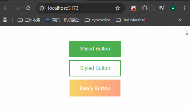
按照这种方法,还可以添加多种伪类,比如说:
xxxxxxxxxx11&:active{}2&:focus{}3&:checked{}4&:nth-child(){}5&::before{}6&::after{}7 - Passed Props and Adding Attributes
styled components会传递html元素上的任何属性。比如说:
xxxxxxxxxx11<StyledButton type="submit">Styled Button</StyledButton>查看真实DOM,可以看到type属性已经传递了:

styled components支持定义元素的属性,避免在使用的时候,一直要传递属性。
x
1// src\components\Button\Button.styles.ts23import styled from "styled-components";457// 定义元素的属性,使用 .attrs() 方法8export const SubmitButton = styled(StyledButton).attrs({9 type: "submit"10})`11 box-shadow: 0 9px #999;12 &:active {13 background-color: ${props => props.variant !== "outlined" ? "#fff" : "#4caf50"};14 box-shadow: 0 5px #666;15 transform: translateY(4px);16 }17`x
1// src\components\Button\Button.tsx23import { StyledButton, FancyButton, SubmitButton } from "./Button.styles";45export default StyledButton;6export { FancyButton, SubmitButton };x
1// App.tsx23import "./App.css";4import StyledButton, { FancyButton, SubmitButton } from "./components/Button/Button";56function App() {7 return (8 <>9 <SubmitButton>Submit Button</SubmitButton>10 </>11 );12}1314export default App;可以看到,这个button上面加上了type属性:

同时,.attrs()方法里面还可以接收props参数,让里面的属性(比如说type)的值根据props参数来决定。
xxxxxxxxxx1111// 定义元素的属性2export const SubmitButton = styled(StyledButton).attrs(props => ({3 type: "submit"4}))`5 box-shadow: 0 9px #999;6 &:active {7 background-color: ${props => props.variant !== "outlined" ? "#fff" : "#4caf50"};8 box-shadow: 0 5px #666;9 transform: translateY(4px);10 }11`8 - Animations
可以使用styled components提供的keyframes方法,来创建动画效果。
x
1// src\components\Button\Button.styles.ts23// 1、引入styled函数4import styled, { keyframes } from "styled-components";568// 定义动画9const rotate = keyframes`10 from{11 transform: rotate(0deg);12 }13 to {14 transform: rotate(360deg);15 }16`1718export const AnimatedLogo = styled.img`19 height: 40vmin;20 pointer-events: none;21 animation: ${rotate} infinite 20s linear;22`xxxxxxxxxx151// App.tsx23import "./App.css";4import { AnimatedLogo } from "./components/Button/Button.styles";5import logo from "./assets/react.svg";67function App() {8 return (9 <>10 <AnimatedLogo src={logo} />11 </>12 );13}1415export default App;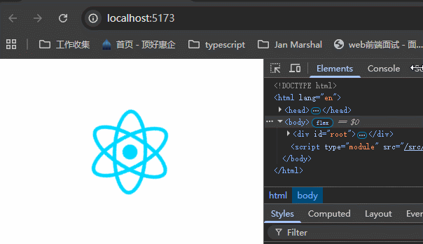
9 - Theming
这个库也提供主题定义功能,使用它的ThemeProvider。
x
1// App.tsx23import "./App.css";4import { ThemeProvider } from "styled-components";56// 可以自定义主题7const theme = {8 dark: {9 primary: "#000",10 text: "#fff",11 },12 light: {13 primary: "#fff",14 text: "#000",15 },16};1718function App() {19 return (20 // 使用ThemeProvider给组件提供上下文21 <ThemeProvider theme={theme}>22 ......23 </ThemeProvider>24 );25}2627export default App;那么我们就可以使用提供的主题来创建组件:
x
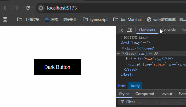
1// src\components\Button\Button.styles.ts23import styled, { keyframes } from "styled-components";457export const DarkButton = styled(StyledButton)`8 border: 2px solid ${props => props.theme.dark.primary};9 background-color: ${props => props.theme.dark.primary};10 color: ${props => props.theme.dark.text}11`使用这个组件:
x
81// App.tsx23<ThemeProvider theme={theme}>5 <DarkButton>Dark Button</DarkButton>6</ThemeProvider>效果:
10 - Global Styles
这节课学习怎么创建全局样式,一般来说,全局样式写在一个单独的css文件里面,然后在App.tsx里面引入。但这里我们学习使用styled提供的createGlobalStyle方法来创建全局样式。
x
1// App.tsx23import "./App.css";4import StyledButton, { FancyButton, SubmitButton } from "./components/Button/Button";5import { createGlobalStyle, ThemeProvider } from "styled-components";67// 可以自定义主题8const theme = {9 dark: {10 primary: "#000",11 text: "#fff",12 },13 light: {14 primary: "#fff",15 text: "#000",16 },17};1819// 创建全局样式20const GlobalStyle = createGlobalStyle`21 button {22 font-family: "Roboto";23 }24`;2526function App() {27 return (28 <ThemeProvider theme={theme}>29 {/* 以组件的形式来注册全局样式 */}30 <GlobalStyle />31 32 <StyledButton type="submit">Styled Button</StyledButton>3334 <StyledButton variant="outlined">Styled Button</StyledButton>3536 <FancyButton as="a">Fancy Button</FancyButton>3738 <SubmitButton>Submit Button</SubmitButton>39 </ThemeProvider>40 );41}4243export default App;可以看到,变为了Roboto字体。

因为全局样式是以组件的形式注册的,所以全局样式组件里面也可以接收到theme上下文,所以可以这样写:
x
1// App.tsx235const theme = {6 dark: {7 primary: "#000",8 text: "#fff",9 },10 light: {11 primary: "#fff",12 text: "#000",13 },14 fontFamily: "Segoe UI",15};1617const GlobalStyle = createGlobalStyle`18 button {19 font-family: ${(props) => props.theme.fontFamily};20 }21`;2223可以看到,变为了Segoe UI字体。
